Tourism · Games · Tours · Museums
The system had become cluttered and unintuitive. The goal wasn’t just a visual refresh—it was a structural redesign.
UX Strategy · User Research · Prototyping · UI Design
24 months
Locatify powers location-based storytelling — treasure hunts, museum guides, and interactive tours used worldwide. At the center of it all is the Creator CMS.
Over time, the platform grew fast. New features were added. Advanced functionality layered in. But the structure underneath didn’t evolve with it.
The CMS became powerful — but increasingly hard to navigate.
Creators were asking: "Where do I click?"
Instead of: "Let’s build something cool."
Turfhunt app
The system had become cluttered and unintuitive — especially for non-technical users. Common issues included:
Support requests increased. Onboarding slowed down. Creative flow was interrupted. The goal wasn’t just a visual refresh. It was a structural redesign — making the CMS intuitive, scalable, and aligned with how creators actually think.
I led UX and UI design across a 24-month transformation. Responsibilities included:
This was a system-level redesign — not a surface update.
Empathy Map
Research revealed something critical: Users weren’t struggling with features. They were struggling with structure. The CMS was organized around technical logic. But creators think in stories. They think in moments, locations, and player experiences — not in content types and nested menus.
That shift in perspective changed everything. We stopped asking: "How do we clean up the interface?" And started asking: "How do we redesign the mental model?"
We anchored every decision in three principles:
We reworked the information architecture to reflect real creative workflows. Clear hierarchy. Consistent navigation. Breadcrumb orientation.
The Tour Editor was rebuilt into a modular, card-based system. Each stop became a self-contained, editable unit — keeping content, media, and logic in context. Creators no longer had to mentally stitch pieces together. They could build experiences without breaking flow.
We introduced modular UI patterns and reusable components, forming the foundation of a growing design system and enabling faster future updates.
Research Insights
The redesigned CMS launched as a major platform update. Results included:
But the real success was behavioral: Creators stopped navigating the system — and started creating within it.
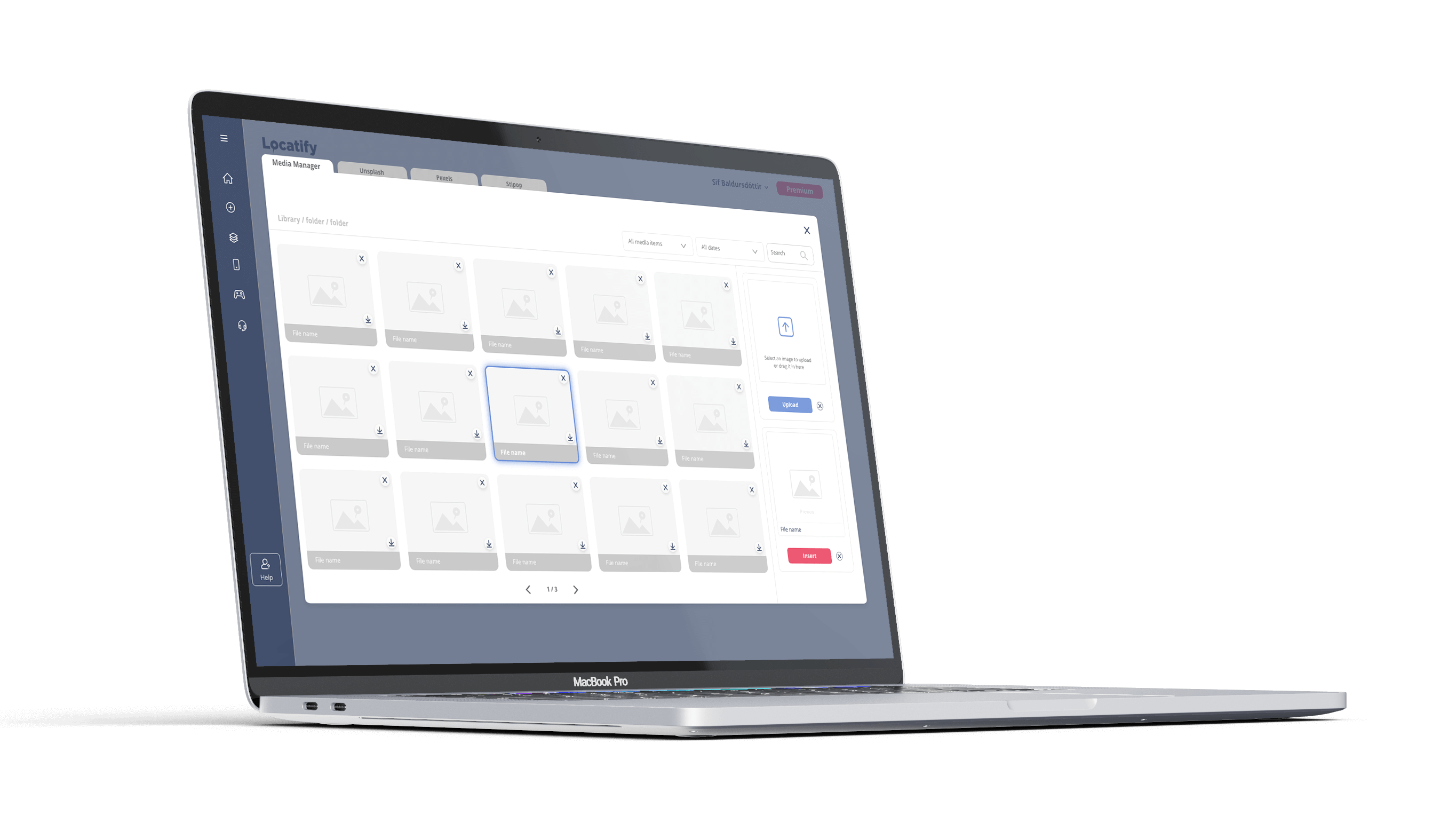
Prototype of the Media Manager
This project reinforced a core belief: Complexity isn’t caused by too many features. It’s caused by unclear structure.
When structure is intuitive, creativity feels effortless. Designing CMS tools isn’t about aesthetics — it’s about making complexity invisible. And that’s the kind of real-world problem I love solving.
Prototype of the Tour Creator
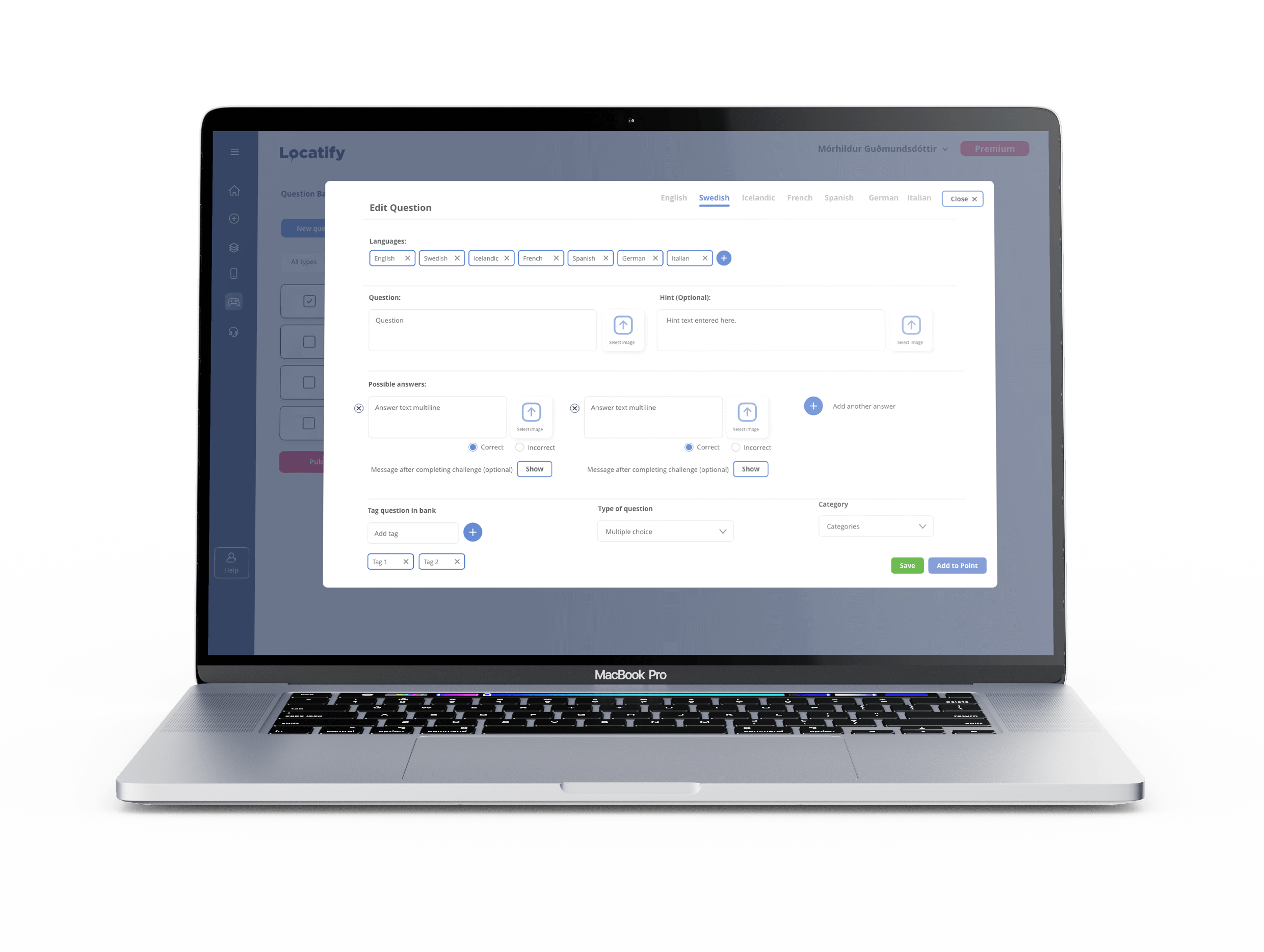
Prototype of the Question Bank
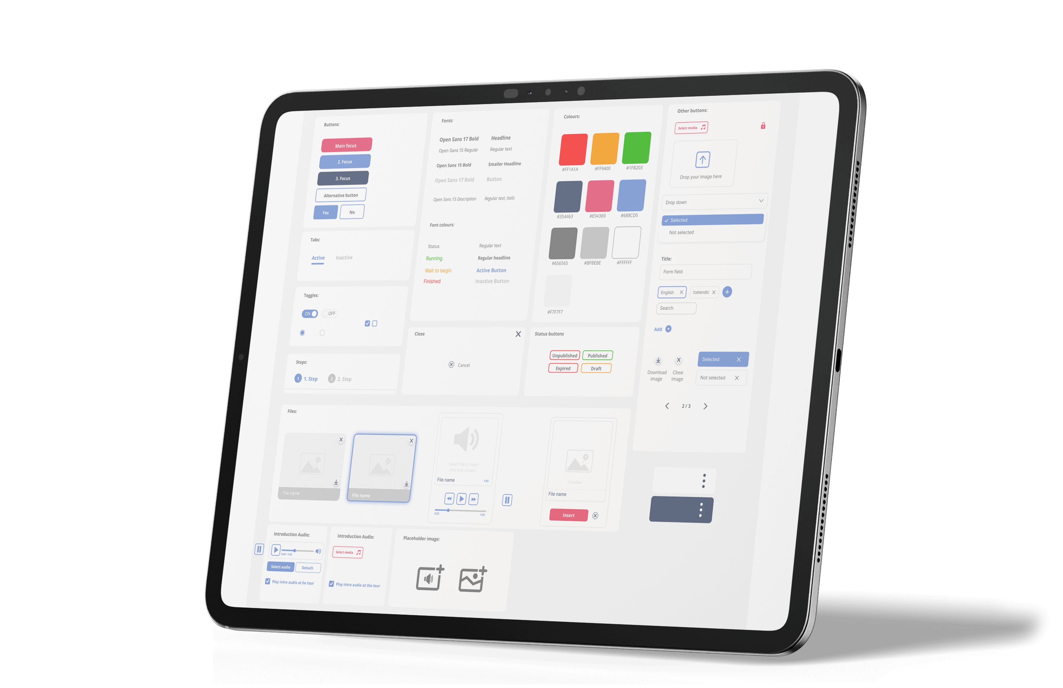
Part of the Design System